the UI’s toolbar currently provides space for cut & paste, undo/redo. I can also access these functions via the normal menu - and I rarely do.
I suggest to use the toolbar space for something better, and save me clicks.
Specifically, I would like to have the add new entry editor swifter available: i.e. a text field in which I can paste a doi, and in click generate a new entry; rather than having to click extra on “new entry”, before I get the new entry window.
Please discuss here what functions you like to have in the toolbar
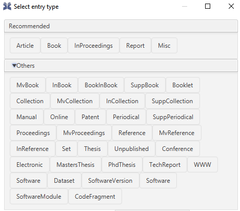
oh, the brand new thing looks neat, but is it really necessary? I guess the standard select entry type could be well combined with this:
It could be “add new entry” with two subsections,
select entry type
generate automatically by ID
The brand new thing requires as many clicks as the already existing function in “select entry type”, it seems to me so at least.
True, Ingmar. the new ‘import by ID’ needs the same amount of clicks as using the DOI function under ‘select entry type’, UNLESS one wants to change the entry or ID type. Then you need two more clicks. So i think it is good to have it. How would your proposal save another click? Sorry, I can’t see it.
While i think it is best to have ONE feature that provides the entry point for creating/importing entry data (via ID; manually; new entry from plain text; etc.) for reasons of clarity and having a user interface that is not crowded with many buttons … it is good to have these four functions there if one wants to minimize clicks.
Maybe a merger of new article and new entry would be a step forward?
My proposal would be:
rename new article to new entry and
rename old new entry to something like configure entry type.
Give configure entry type a symbol similar to this
Let new new entry remember what one has chosen in old new entry.
For clarification new entry should remember what i chose here
Get rid of this part of the current select new entry UI:
and merge it with web search:
For a user that has no clue about the shenigans that go on in the background of JabRef, there is no way to distinguish between the two and websearch is such a big pice of the UI that people will use it a lot because it stands out very much. For the same reason i also would
make import by ID more visible and recognizable.
E.g.
The current arrow is very … expressionless.
It gives new users of JabRef no idea what to expect when clicking on it. I think it is one of the most important features JabRef has and it should be very visible.
Maybe merge it also with Websearch? It could look like this:
Where exactly these search bars are located in the UI is less important than the overall reduction in UI complexity and increase in visibility of features. (New) Users should have an idea about what key and most often used elements of the UI do, without having to first hover over the buttons and having to read their explanation. It would argue that import new entry by ID is such a key element.
Finally, in generall, these pieces of UI are really well made. I like them a lot and i am sure power users put them to good use. Would be a shame to dump it altogether
That is a great detailed reasoning, ThiloteE, at least in my reading. Thank you.
Your first point merger of new article and new entry is one point that I would definitively support. Though, as a footnote to this, is (something I mentioned ages ago, I think, on github) that if we remember something, would be ideal to also use remembering for “recommending” entry types, rather than hard coding these. But, ok, this is not the main issue of this conversation.
ad 2: I am not convinced by separating new entry and import by ID. When I search for literature within JabRef’s UI of external sources, then I do so in lieu of importing or constructing some entry by ID. But how about others? Do users often search externally without importing?
ad 3: This is key: simplify. If my prior ad 2 is accepted, then actually offering one view to search and add/configure an entry might be an interesting perspective. So, this could imply integrating the functions of web search and select new entry including import by ID.
And this all assumes that users actually want to have two search fields, one for local search and one for external search. From a user perspective, might it be even more simple/straight forward to think of one “universal search” bar? JabRef has already a wonderful search bar. I could imagine a user logic by which I search both local and external sources simultaneously, and get offered to import an external entry (or merge). Though the latter would involve a rethinking of the external window by which external entries are represented. A compromise might also be: if my local search leads to nothing, JabRef might offer to me to switch to Web search instead.
ad 1: i have thought about it again and renaming new entry is not perfect. I would rather merge the two buttons into 1,5 buttons.
To minimize clicks, the left side of the button should be new article + remember-function.
The right side of the button should be an vertical arrow pointed downwards (signifying choosable option) that opens the ‘recommended’ and ‘others’ menu.
The overall amount of clicks needed should not change. If we go into a full merger that opens a new menu when clicking on new entry as you would suggest Ingmar, it would lead to one more click if one just wants to quickly create a new entry without choosing another type of entry.
ad 2: Another EASY way to get rid of clicks: Make a keyboard shortcut e.g. ctrl+i to jump directly to the import by ID searchbar. This should work wherever the searchbar is located, although i would suggest the search bar to be not hidden behind a button. The keyboard shortcut should be written within the searchbar to make it easier for new users to know that this exists. Just like Thunderbird does.
ad 3: Not sure about merging web search and local search. Might become very confusing and complicated. How to differentiate between entries that are already in your library and the ones that are only on the web? Will there be error messages when i don’t have a connection the web but try to search my offline database? .
Do i want to make a web-search mandatory for users with potentially limited bandwidth? What if they don’t have a internet flat-rate but use volume tarif? - Yes there are regions in the world where this is the case. I think separating web search and offline local entry search is fine as is.
I agree, i never use this… but my mother probably would use it. It is good for all people that are not good with IT. Unless we really run out of space in the UI, i think leaving it there is fine. If it were possible to move parts of the row upwards we could gain space.
status quo is:
1.1. ‘minimize clicks’;
1.2. Too many buttons in UI?
1.3. Almost no text in UI; Mostly symbols
Change could be:
2.1. Consolidation and merging buttons into one button or at least less buttons.
2.2. Buttons with Symbol and Text next to it.
2.3. Buttons without Symbol and only text
2.4. Changing Symbols and renaming buttons.
Hence, critical decision that have to be made (if doing a rework on this):
3.1. Minimize clicks vs. clean UI (merged button).
3.2. Clean simple and orderly UI with small buttons (for powerusers) vs. UI (e.g. with text) that is easy to understand on first glance (for new users).
.
.
.
Compromise X that allows to merge the 4 buttons new articlenew entryImport by ID and New entry from plain text into one without increasing the amount of clicks for powerusers would be to
4.1. Add keybindings (keyboard-shortcuts) in the submenu for new articleImport by ID and new entry from plain text
4.2. Make It so that import by ID is the preferred option and when clicking on the new single consolidated button the cursor automatically jumps to the import by ID field. This leads to equal amount of clicks for import by ID field, but more clicks for new article and new entry from plain text, unless option 4.1 is implemented.
4.3. Rename new article (which is now hidden in a submenu behind the ONE button) to new entry and give it a remember function that remembers the article type that was chosen in the current old new entry dialogue.


 .
.
